UX Case Study: Therapy App
Inspiration
The year was 2021. The long-awaited Google UX Design Professional Certificate had finally launched on Coursera.
Had I already read books about UX Design and taken self-paced courses to learn the fundamentals of design thinking? Yes. Had I also already been through a Full Stack Software development bootcamp in person where I learned about the software lifecycle and worked with other aspiring developers on coding exercises and projects? Also yes! Was I living through a once-in-a-lifetime (hopefully) global pandemic?! YES, WE WERE!
So, I was curious. It seemed to me that UX practices are diverse enough across the industry that another perspective could only benefit me. What else could I learn to ready me for the job market?
The Google UX Design Professional Certificate asks students to complete a project as they learn to practice new design skills and get feedback from peers. Having previously completed a case study inspired by my own experiences as a high school English teacher, I wanted to focus on another real-life interest of mine: mental health and expanding access to therapy.
The Problem
A counseling center in Nashville, TN, wants to build a mobile app in order to attract new clients to and to support existing clients in managing their appointments. Because people have online options for therapy like BetterHelp and Talkspace, the counselors want to offer a more modern platform for their clients to access counseling. We want this app to increase the center’s client pool and increase client satisfaction with the counseling center.
UX Research Methods
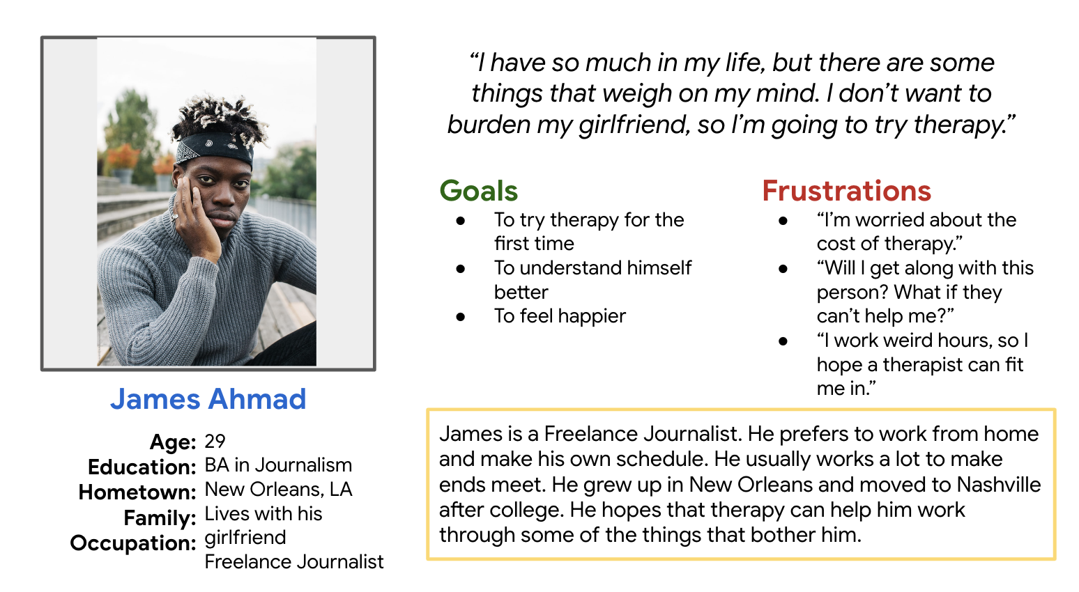
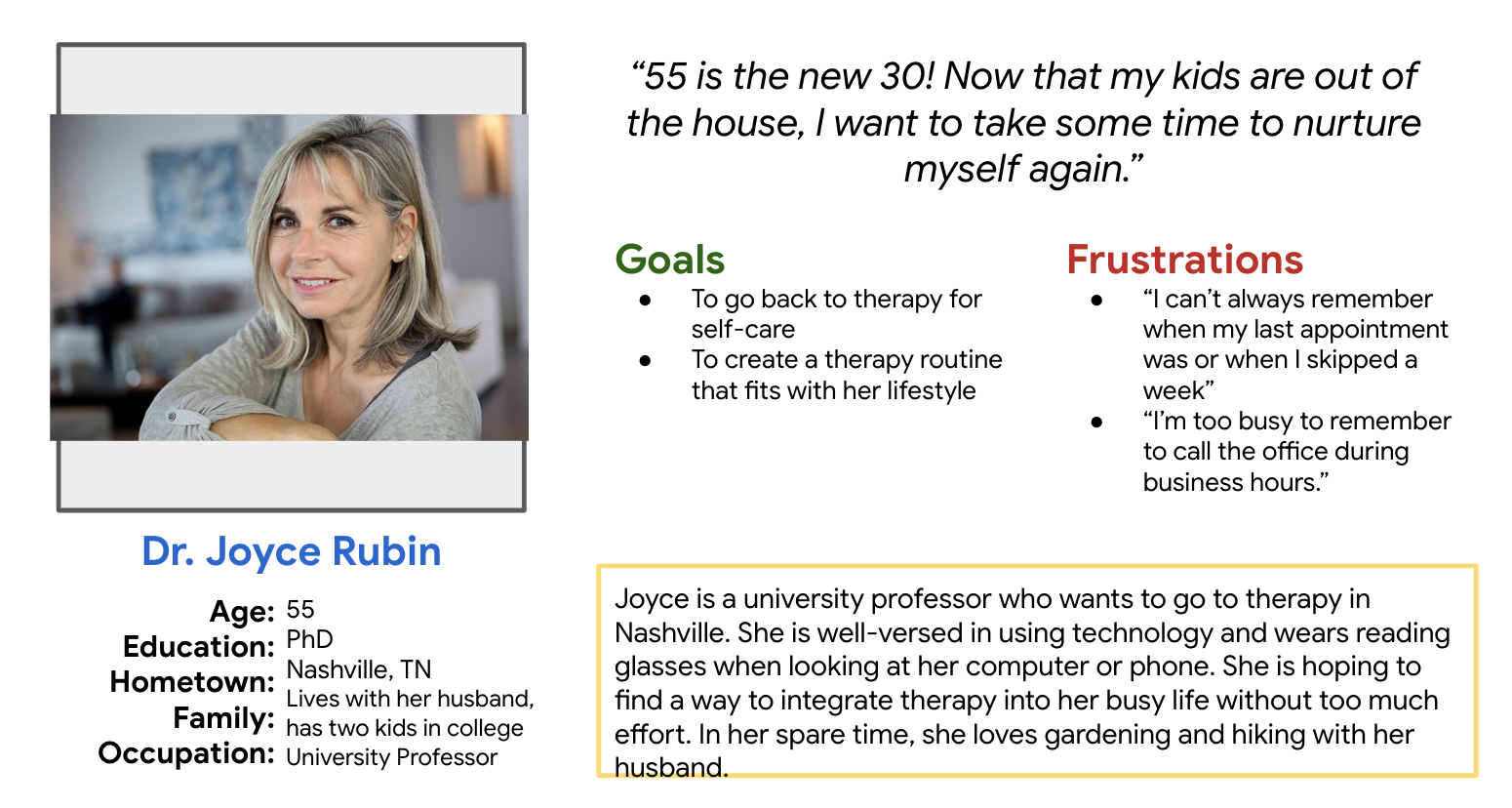
The Google Courses provided detailed instruction on many research methods. For my certification project I completed an unmoderated usability study and a competitive analysis; I also created personas and used clickable prototype testing.
Wireframes
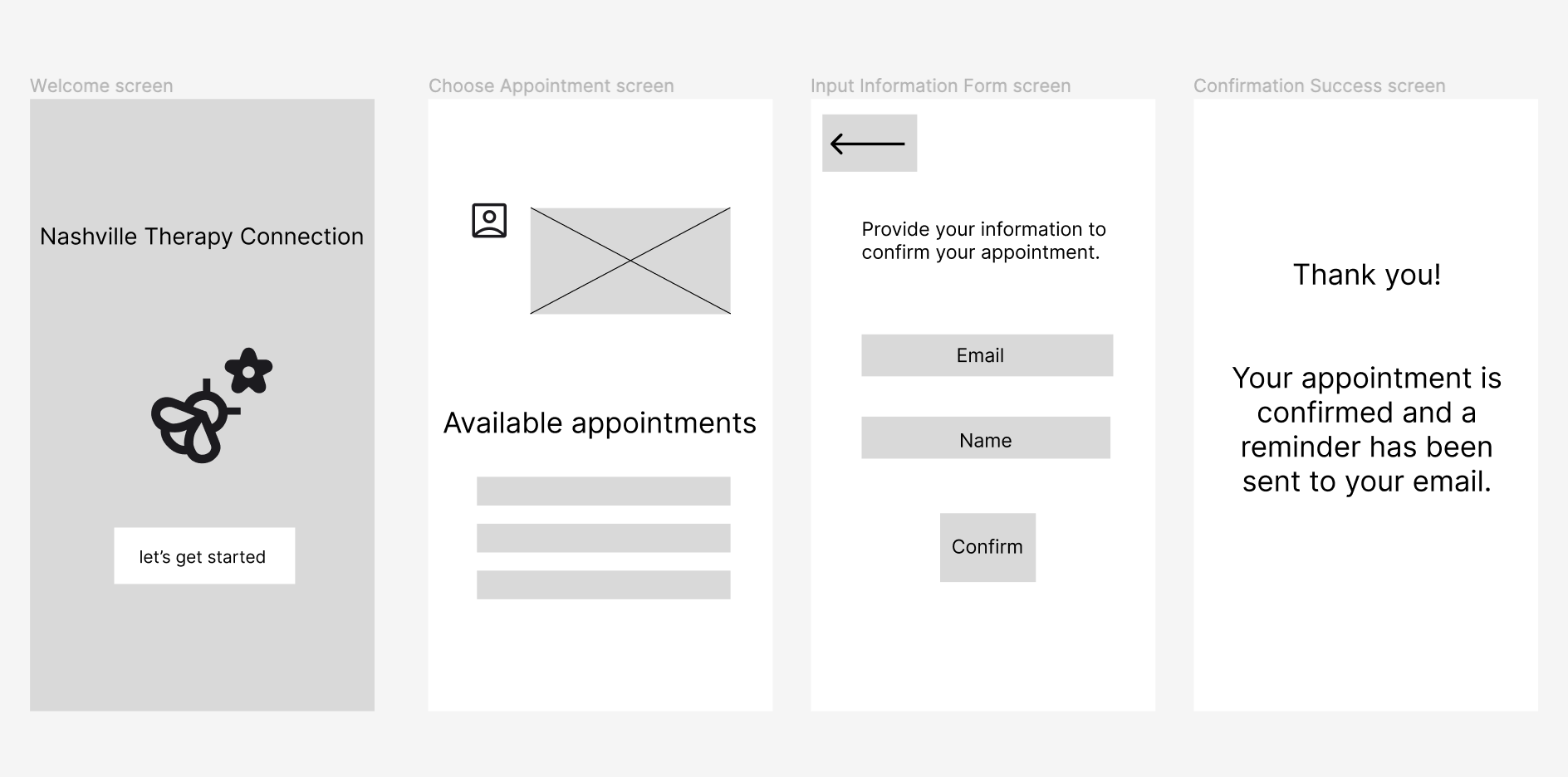
I turned my ideas and sketches into neater wireframes using Figma.
Therapy App affinity diagram
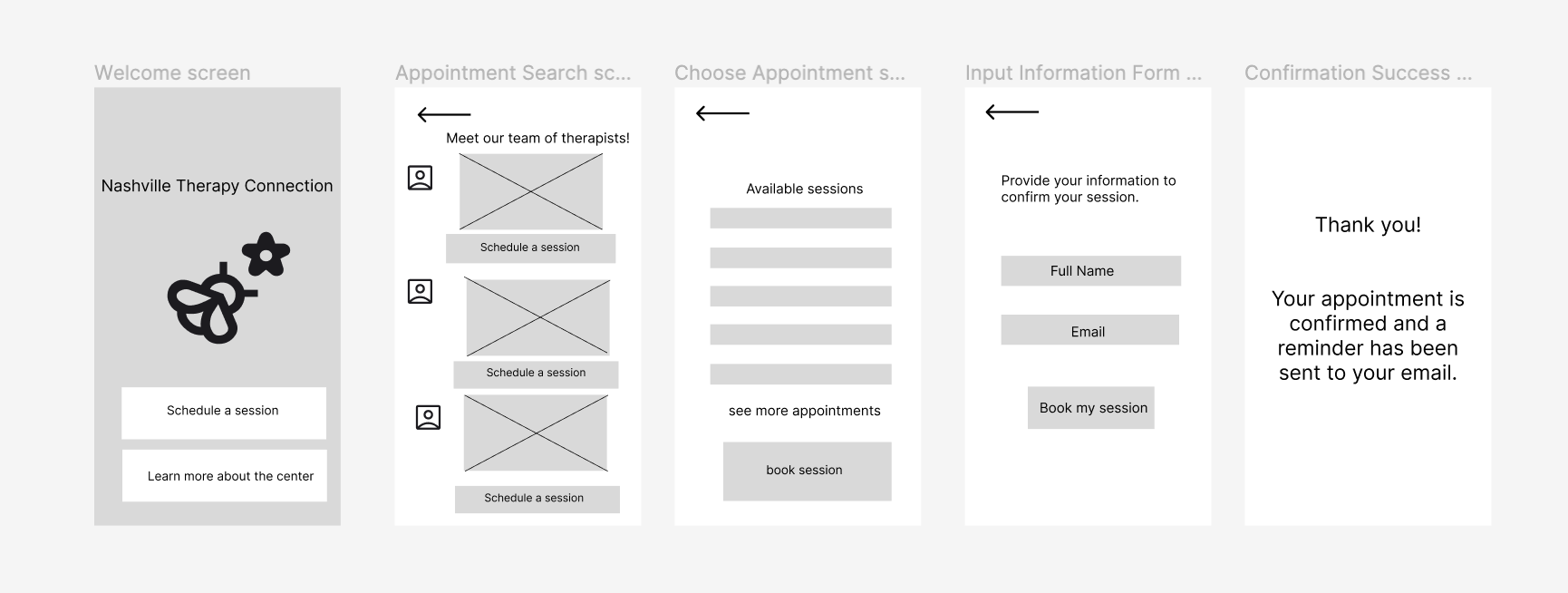
Organizing the users’ responses in an affinity diagram allowed me to visually represent the insights from the study and make decisions for the next wireframes. For example, in the next iteration, I chose to modify the home screen and flesh out the appointment making feature in response to users’ feedback.
Revised Wireframes
My goal in revising the app’s wireframes was to increase the user’s confidence and ability to complete the task of booking an appointment with the counseling center using only the app.
Therapy App prototype
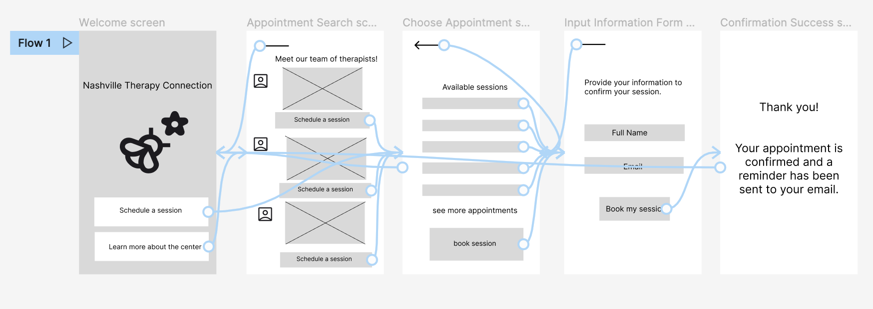
I then created this clickable prototype created in Figma.
Reflections
gained a new perspective on UX process
practiced skills I may not have otherwise like completing a Competitive Analysis
valuable feedback from others based on the course rubrics
fueled desire to conduct UX research within a design team working on a real and evolving product

